How to Design a Logo for your Brand A Comprehensive Guide
Vivek Goel
February 8, 2025
Table of Contents
Once you’ve given your brand a name, crafting a compelling brand logo is the next crucial step towards establishing its recognition. The logo stands as the ambassador of your business. It is the first visual impression, the immediate identifier, and the visual language that communicates the essence of your brand.
In the dynamic realm of how to design a logo, understanding various types is paramount. Let’s delve into the intricacies of different logotypes that define and rely on distinct typography to spell out the brand’s name, each type has its unique strengths and considerations. From Lettermarks to Pictorial Marks and beyond, explore the diversity of logo styles and their pros and cons.
Different Types of Logo
1. Wordmark or Logo type
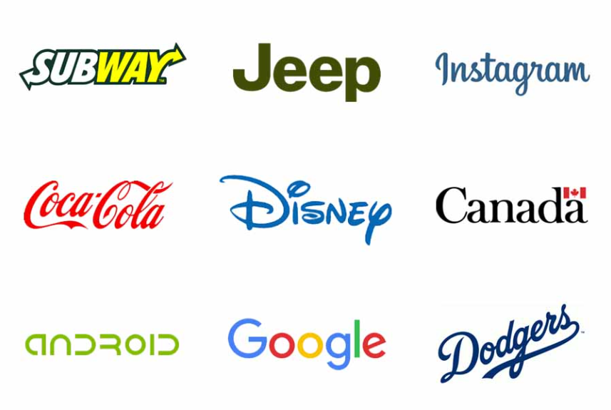
A wordmark or logotype is a type of logo that consists of the written name of a company using a specific and recognizable writing style. It is like a visual representation of a brand’s name.
Example: Google and many more
Pros:
- High readability and clarity.
- Establishes brand name prominently.
- Memorable when the brand name is distinctive.
Cons:
- Less visual representation without accompanying symbols.
2. Lettermark or Monogram
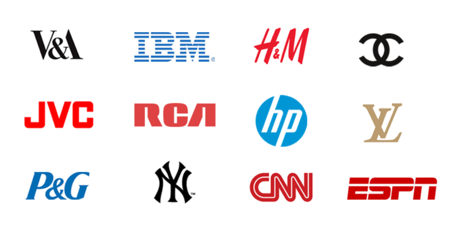
A letter or monogram is a type of logo that uses the initials or abbreviations of a company’s name to create a unique design. It doesn’t show the full name but focuses on combining specific letters uniquely and artistically, often creating a symbol that represents the brand.
Example: IBM and many more
Pros:
- Simplifies long brand names.
- Can create a strong visual identity.
Cons:
• Limited representation of the brand name.
3. Pictorial Mark or Symbol
A pictorial mark is a logo that uses a simple picture or a symbol to represent a brand. It relies on a unique and easy-to-remember image instead of using words.
Example: Apple
Pros:
- Instant recognition.
- Versatile and easily scalable.
Cons:
- May not convey brand name directly.
4. Abstract logo mark
An abstract logo is type of logo design that doesn’t represent what a company does but uses unique shapes, forms or colors to create a distinctive and memorable visual identity. It relies more on creative elements rather than literal representations.
Example: Nike
Pros:
- Represents the brand without literal imagery.
- Aesthetic flexibility.
Cons:
- Interpretation can vary.
5. Mascot
A mascot logo design features a character or a figure as the face of a brand. This character is often cute, friendly, or has a unique personality.
Example: Tony the Tiger (Kellogg’s Frosted Flakes)
Pros:
- Creates a personable brand.
• Memorable and often used for storytelling.
Cons:
- Requires consistent character development.
6. Combination Mark
A combination mark is a logo which combines both a wordmark and a symbol or icon. It’s like you can see the brand name and a unique symbol all together.
Example: Adidas, Orange Owl
Pros:
- Blends text and symbol for comprehensive branding.
- Versatility in usage.
Cons:
- Complexity might reduce scalability.
7. Emblem
An emblem logo is like a special picture or symbol that’s surrounded by the name of a company or brand. It’s all bundled together, creating a complete and compact design.
Example: Harley-Davidson
Pros:
• Traditional and classic appearance.
• Often seen as prestigious.
Cons:
- Can be less versatile due to the enclosed design.
8. Responsive or Dynamic Logo
A responsive or dynamic logo is designed to adapt and change based on different contexts, devices, or platforms. It’s like having a logo that’s flexible and can adjust its appearance to fit various situations.
Example: Coca Cola

Pros:
- Adaptable across various digital platforms.
- Ensures consistency in diverse contexts.
Cons:
- Complex to design and may lose some brand elements.
9. Watermark or Submark
A watermark or submark is like a tiny, simplified version of a logo. It’s a small and often subtle image or design that represents a brand. Think of it as the brand’s mini-signature that can be placed in the corner of a document, photo, or other materials without taking too much attention
Example: Starbucks’ Siren
Pros:
- Simplified version for small spaces.
- Enhances brand recognition.
Cons:
- Limited information conveyed.
10. Badge
A badge logo is like a special stamp or emblem for a brand. It’s a design that often looks like a cool badge you might find on a uniform or a product. This type of logo usually has a unique shape and includes both a picture or symbol and the name of the brand.
Example: Instagram
Pros:
- Distinctive shape enhances recognition.
- Versatile and can be used in various contexts.
Cons:
- May not work well without surrounding space.
11. Handwritten or Script
A handwritten or script logo is like having a brand name written in a way that looks like someone’s handwriting. Instead of using a standard, formal font, the letters have a more personal and unique touch, resembling natural handwriting.
Example: Coca-Cola

Pros:
- Conveys a personal and authentic feel.
- Can enhance brand personality.
Cons:
- May be less readable, especially in small sizes.
12. Gradient Logo
A gradient logo is like a logo that uses a blend of colors instead of just one. Instead of being a single solid color, it smoothly transitions from one color to another, creating a cool and gradual change. It’s like having a rainbow effect in your logo.
Example: Instagram

Pros:
- Visually striking and modern.
- Allows for creative expression.
Cons:
- May not work well in monochrome or simple applications.
In summary, choosing the right logo type is pivotal for a startup’s brand identity. From wordmarks to mascots, each logo style has unique advantages. Designing an effective logo involves meticulous consideration of the brand’s identity, competition, and audience preferences. Whether opting for simplicity or embracing trends, the goal is to create a timeless logo that resonates and forms a lasting connection with the audience.
Adhering to principles like simplicity, versatility, scalability, and timelessness ensures a logo distinguishes itself, serving as a powerful ambassador for the brand. Now that we have understood the logo types, let’s jump into steps on how to design a logo for your brand.
Steps on How to Design a Logo for Your Brand
The process of creating a logo goes beyond just graphical elements; it involves a deep understanding of your brand’s personality, values, and the message you want to convey to your audience.
1. Understand your Brand identity
First you should clearly define your brand identity by understanding your startup’s mission, values and target audience. Logo should represent your brand so a solid foundation is crucial
Eg: Nike
Nike’s swoosh symbolizes motion, aligning perfectly with their athletic and dynamic brand. Orange Owl’s logo carries arrow elements representative of growth and progress, aligning with its mission to help businesses grow and earn their true potential.

Orange Owl’s logo carries arrow elements representative of growth and progress, aligning with its mission to help businesses grow and earn their true potential.
2. Competitor Research
Analyse logos within the industry to meet common themes and design elements. The goal is to distinguish.
Eg: Lyft vs Uber
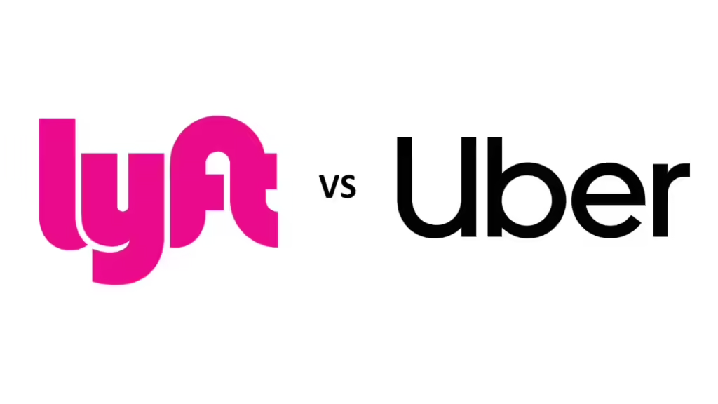
They both use sleek, modern designs. Lyft uses a vibrant color palette while Uber opts for simplicity and versatility.
3. Understand Audience
Resonate your logo with the target audience considering their preferences, demographics and the message you want to convey.
Eg: Spotify

Spotify’s green logo is associated with energy, harmony and the brand’s commitment to provide an immense music experience.
4. Sketch and Brainstorm
The process should be started with pen and paper. Explore various concepts and ideas before refining them digitally.
Eg: Google, FedEX
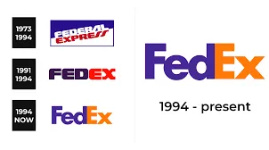
These logos went through various sketches before arriving at its current design
5. Simplicity is Key
Simplicity is the key. Think of iconic logos and avoid complex designs that are confusing or difficult to reproduce.
Eg: Apple
The Apple logo where a sleek apple silhouette speaks volumes can be considered as simplicity, clean, memorable and easily recognizable
6. Choose colors wisely
Colors evoke emotions and associations. Ensure the chosen colors are versatile enough for various applications.
Eg: McDonald’s

The use of red and yellow is strategic where red stimulates appetite and while yellow evokes a sense of joy
7. Fonts
If text is included in the logo the fonts convey a specific tone, so choose a font that aligns your brand and is easily readable in different sizes and formats.
Eg: IBM

IBM’s logo features bold, uppercase font that exudes stability and professionalism
8. Versatility
As logo appears on various platforms ensure it remains effective and recognizable in different sizes and formats.
Eg: Adidas
Adidas’ logo is versatile enough to be displayed on various products. The three stripes, known as the “Adidas Stripes,” are recognizable across footwear, apparel, and accessories.
9. Feedback
The feedback should be gathered from your team, potential customers or focus group. Honest opinions can provide valuable insights and help you refine your logo further.
Eg: Instagram

Its logo is updated based on user feedback. The simplified camera icon reflects the platform’s evolution and the vibrant colours convey a sense of creativity and diversity
10. Scalability
The logo can be displayed on varied platforms from business cards to billboards and merchandise. Scalable design can ensure that the logo retains clarity and impact across all sizes. You want a logo that can be blown up super large for a billboard or scaled down for screening onto the side of a pen.
Eg: McDonald’s

The golden arches are simple and can be displayed on any platform.
11. Timelessness over trends
Trends come and go but a timeless logo endures. So design a logo that won’t become outdated easily.
Eg: Coco-Cola
This logo has remained constant and unchanged over a century
12. Balance and Proportion
A logo should ensure that no element overpowers the others.
Eg: WWF panda logo

If we consider this logo there is a harmonious balance between the panda, illustration and text.
13. Legal Complications
Check your trademarks before finalizing your logo and ensure there are no legal issues. Originality is crucial to avoid future conflicts and protect your brand from the start.
Eg: Starbucks

It has changed over the years. The current design is unique and trademarked to avoid legal issues.
Ensuring Logo Versatility Across Contexts
Why Logo Versatility Matters Your logo won’t just appear in one place; it’ll be used across a variety of platforms and media. Whether it’s on a website, business card, social media, merchandise, or even a billboard, your logo must be versatile enough to maintain its impact no matter where it’s seen. Ensuring that your logo works in different colors, sizes, and contexts is essential to maintaining a strong and consistent brand presence.
Creating Multiple Logo Variations
A well-designed logo should have several variations to ensure it looks great in any situation. Here’s what you should consider:
Full-Color Version:
- This is your primary logo, designed in your brand’s colors.
- Use it on your website, social media profiles, and other primary branding materials.
Black-and-White Version:
- A monochrome version of your logo ensures it remains effective in grayscale or when printed without color.
- This version is especially useful for documents, newspapers, and some promotional materials.
Reverse/White Version:
- This is a white version of your logo designed to stand out against dark backgrounds.
- It’s perfect for use on dark-themed websites, banners, or any medium where the primary logo’s colors might not be visible.
Simplified/Submark Version:
- A simplified version of your logo is used in smaller spaces where the full logo might not be legible.
- Often used as watermarks, social media profile pictures, or on small merchandise.
Adapting Your Logo for Different Backgrounds
Logos should be tested across different background colors to ensure they remain clear and impactful. Here’s what you should do:
Light Backgrounds:
- Use your full-color logo or a darker version of your logo to maintain contrast and readability.
- Test it on white and other light backgrounds to ensure it’s easily visible.
Dark Backgrounds:
- Utilize the reverse or white version of your logo to stand out against dark backgrounds.
- Ensure it’s tested on various dark shades to confirm its effectiveness.
Design Checklist for a Versatile Logo
To ensure your logo is versatile and ready for any application, here’s a checklist you can follow:
Test Across Multiple Backgrounds:
- Light, dark, textured, and colored backgrounds.
Create Multiple Variants:
- Full-color, black-and-white, reverse/white, and simplified versions.
Check Scalability:
- Ensure the logo looks sharp and recognizable in both large and small sizes.
Ensure Legibility:
- Make sure any text within the logo is readable at different scales.
Maintain Brand Consistency:
- Verify that all versions align with your brand’s visual identity.
Adaptability:
- Confirm that the logo can be adapted for various mediums—print, digital, merchandise, etc.
Examples of Effective Logo Variations
Nike:
- The Nike Swoosh is versatile enough to be used in full color, black-and-white, and as a standalone mark across different contexts.
Apple:
- Apple’s logo is highly adaptable, functioning in both monochrome and full color, maintaining its sleek, modern look in any context.
Starbucks:
- The Starbucks Siren logo has simplified versions used on smaller products and in various color schemes that adapt to different packaging.
Visualizing the Logo in Real-Life Contexts
To ensure your logo works in the real world, visualize it on:
- Business cards
- Websites
- Merchandise (like T-shirts, mugs)
- Social media profiles
- Storefront signage
- Digital and print advertisements
Favicon Design: Extending Your Brand Identity
What is a Favicon?
A favicon (short for “favorite icon”) is a small, 16×16 or 32×32 pixel square icon that represents your website in browser tabs, bookmark bars, and within apps. It’s a crucial yet often overlooked aspect of brand identity, as it helps users recognize and locate your site quickly among many tabs.
Tips for Designing a Favicon:
- Simplify: Your favicon needs to be extremely simple and recognizable even at a tiny size. This often means using a single element from your main logo.
- Contrast: Ensure your favicon has enough contrast to be visible against different browser backgrounds.
- Test Different Sizes: While the standard size is 16×16 pixels, test how it looks in larger sizes, such as 32×32 and 48×48, to ensure clarity.
Examples of Effective Favicons:
- Apple: The simple, iconic Apple silhouette is easily recognizable even in tiny sizes.
- Google: The bold “G” from their logo is both distinctive and simple enough to stand out as a favicon.
Essential Logo File Formats for Versatility and Editing
Why File Formats Matter When you receive your logo, it’s crucial to have it in multiple formats to ensure it can be used effectively across various platforms and media. Additionally, having the right files will make it easier to edit or adapt your logo in the future without losing quality.
Key File Formats You Should Receive:
Vector Files:
- Format: AI (Adobe Illustrator), EPS, SVG
- Purpose: Vector files are scalable without losing quality, making them ideal for print materials, signage, and any application where resizing is necessary.
Raster Files:
- Format: PNG, JPG, TIFF
- Purpose: These files are resolution-dependent and best used for digital platforms like websites and social media. PNG files are preferred for their transparency support, while JPGs are commonly used for photographs.
PDF:
- Purpose: PDFs are versatile and widely used for both print and digital documents. They are particularly useful for sharing your logo with partners or vendors in a format that can be easily viewed and printed.
Favicon:
- Format: ICO, PNG
- Purpose: Specifically designed for web use in the browser tab, this small icon format ensures your brand is visible and recognizable online.
Source Files:
- Format: AI (Adobe Illustrator), PSD (Adobe Photoshop)
- Purpose: Source files contain all the layers and original design elements, allowing you or any designer to make future edits or adjustments without starting from scratch.
Ensuring You Have All Necessary Files
When receiving your logo from a designer, make sure to request the following:
- Multiple Versions: Full-color, black-and-white, and simplified versions of your logo.
- All Key Formats: Vector (AI, EPS, SVG), raster (PNG, JPG, TIFF), and PDF.
- Favicon: A small, simplified version of your logo in ICO and PNG formats.
- Source Files: The original design files (AI, PSD) to enable future edits.
Final Checklist for Logo Delivery
Before finalizing your logo, ensure you have:
- All necessary file formats for both digital and print use.
- A favicon version designed and tested for web use.
- Source files to allow for future edits and adaptations.
- Variations of the logo for different backgrounds and applications.
Common Mistakes and Pitfalls in Logo Design
Designing a logo is a critical step in building your brand identity, but there are several common mistakes that can undermine its effectiveness. Avoiding these pitfalls can help ensure your logo stands the test of time and accurately represents your brand.
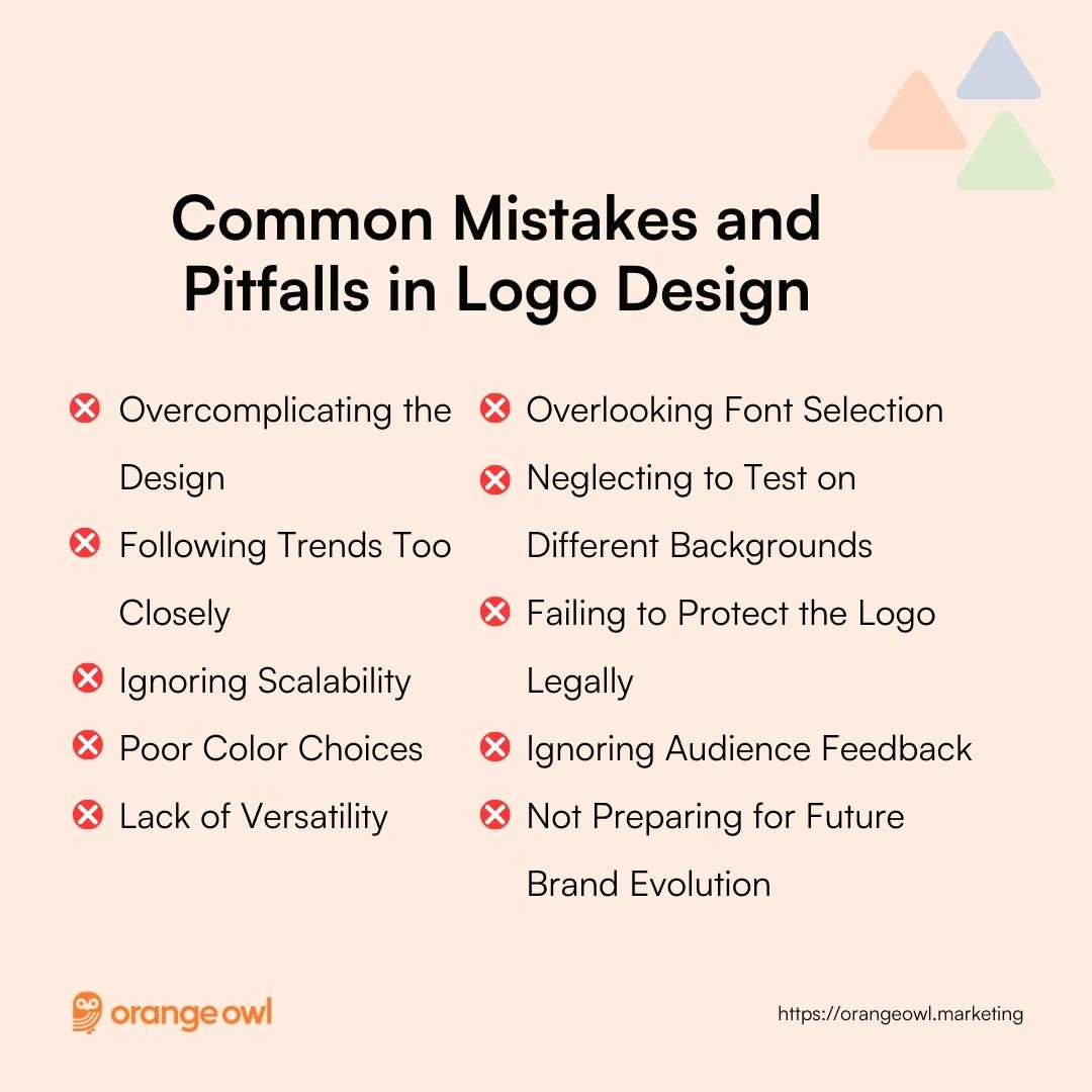
1. Overcomplicating the Design
- Problem: Adding too many elements, colors, or intricate details can make a logo difficult to reproduce, especially in smaller sizes.
- Solution: Aim for simplicity. A clean, uncluttered design is more memorable and versatile. Think of iconic logos like Apple or Nike—simple yet powerful.
2. Following Trends Too Closely
- Problem: Designing a logo based on current design trends can lead to a logo that feels dated as trends change.
- Solution: Focus on timeless design principles rather than fads. Your logo should be able to last for years without needing major updates.
3. Ignoring Scalability
- Problem: A logo that looks great on a billboard might not be legible on a business card or website favicon.
- Solution: Test your logo at various sizes to ensure it remains clear and recognizable, from large formats to tiny icons.
4. Poor Color Choices
- Problem: Using too many colors or the wrong color combinations can make your logo visually overwhelming or ineffective in different contexts.
- Solution: Stick to a limited color palette that reflects your brand’s identity. Ensure your logo works well in both full color and monochrome (black and white).
5. Lack of Versatility
- Problem: A logo that doesn’t adapt well to different media (e.g., print, digital, fabric) can limit its usage.
- Solution: Create multiple versions of your logo (full-color, black-and-white, simplified) and test them across various applications to ensure they all look great.
6. Overlooking Font Selection
- Problem: Choosing a font that doesn’t align with your brand’s personality or is difficult to read can detract from your logo’s effectiveness.
- Solution: Select fonts that are not only visually appealing but also align with your brand’s tone and are easily readable in different sizes.
7. Neglecting to Test on Different Backgrounds
- Problem: A logo that looks great on a white background might disappear or clash on a dark or textured background.
- Solution: Ensure your logo has versions that work on both light and dark backgrounds, and test it in different real-world contexts.
8. Failing to Protect the Logo Legally
- Problem: If your logo isn’t trademarked, other businesses might use a similar design, leading to brand confusion or legal issues.
- Solution: Conduct a thorough trademark search and secure legal protection for your logo to avoid potential conflicts and protect your brand’s identity.
9. Ignoring Audience Feedback
- Problem: Skipping the step of gathering feedback can lead to a logo that doesn’t resonate with your target audience.
- Solution: Collect feedback from potential customers, focus groups, or your team to refine the logo before finalizing it.
10. Not Preparing for Future Brand Evolution
- Problem: A logo that’s too specific or trendy might not align with your brand as it evolves.
- Solution: Design with the future in mind. Ensure your logo has the flexibility to grow with your brand and adapt to new products, services, or markets.
Designing for the Future
Finally, remember that your logo needs to be future-proof. As your brand grows, your logo may need to evolve. However, the core elements should be timeless, ensuring they stay relevant across changing trends and platforms.
Takeaway
Effective logos not only visually represent a brand but also evoke emotions and contribute to brand recognition. The creation of a logo requires creativity, strategic thinking and a deep understanding of a brand. By incorporating these tips into your design process, you’ll be on your way to creating a logo that not only represents your brand but stands the test of time.
Frequently Asked Questions on (FAQs) on How to Design a Logo for your Brand
A successful logo is one that is simple, memorable, and relevant to the brand it represents. It should be versatile enough to work across various platforms and sizes while remaining timeless to ensure it stays effective over the years. Simplicity allows for easy recognition, while memorability ensures that the logo sticks in people’s minds. The logo should also be relevant to the industry and audience, and its design should avoid overly complex elements to maintain clarity at all scales.
To protect your logo legally, you should start by trademarking it, which gives you exclusive rights to its use. Before doing so, conduct a trademark search to ensure no one else is using a similar logo. Consider registering your trademark internationally if you plan to operate in multiple countries. Once your logo is trademarked, use the ® symbol to indicate its registered status and monitor for any potential infringements to protect your brand identity.
The cost of logo design can vary widely, from using DIY logo makers that may cost a few hundred dollars, to hiring freelance designers who typically charge between $300 to $2,500, or working with design agencies, which can cost $2,500 or more. The budget should reflect the quality and value you expect from the design. Investing in a professional logo can have long-term benefits for your brand, so consider the expertise and creativity that different options offer.
Choosing the right designer or agency involves reviewing their portfolio to ensure their style aligns with your vision, understanding their design process, and checking client reviews for reliability and creativity. It’s important to discuss your budget and timeline upfront and ensure good communication throughout the project. A clear contract outlining the scope of work, timelines, and ownership rights will protect both parties and ensure a smooth design process.
A logo is a visual symbol or wordmark that represents your brand, while brand identity encompasses the broader visual and emotional aspects of how your brand is perceived. Brand identity includes your logo, color scheme, typography, and overall style, which together create a consistent brand image across all touchpoints. While the logo is a key element, brand identity is what makes your brand recognizable and trusted by your audience over time.
To ensure your logo is scalable, design it in a vector format so it can be resized without losing quality. Keep the design simple to maintain clarity at smaller sizes and test it across various sizes and platforms before finalizing. Consider creating different versions of your logo for different uses, and make sure it retains good contrast and visibility across different backgrounds. This ensures your logo remains effective and recognizable in all contexts.
Yes, you can update your logo, especially if your brand has evolved or the design feels outdated. A subtle refresh, like adjusting colors or fonts, can modernize your logo while maintaining brand recognition. A complete redesign might be necessary for major rebranding, but it should be approached cautiously to avoid confusing your audience. There’s no set timeline for refreshing a logo; it depends on your brand’s growth and market trends.
Common logo design mistakes include overcomplicating the design, following trends too closely, and ignoring scalability. A logo should be simple, versatile, and timeless. Using too many colors or the wrong font can make the logo less effective. It’s also important to test the logo in different sizes and contexts to ensure it works well everywhere. Finally, don’t forget to legally protect your logo by trademarking it to avoid potential disputes.


