
Introduction
Your homepage is the digital front door of your business. It is often the first impression potential clients have of your company, and in just a few seconds, it can determine whether they stay or leave. According to a study by HubSpot, 55% of visitors spend less than 15 seconds on a website, making it crucial to communicate your value proposition immediately.
What is a Homepage
A homepage is the main entry point of a website, acting as the hub that connects visitors to different sections, products, and services. Unlike B2C websites that focus on quick sales, a B2B homepage must cater to businesses, emphasizing credibility, trust, and long-term value.
Why Does a B2B Homepage Matter?
- First Impressions Count – 75% of users judge a company’s credibility based on website design (Stanford University Study).
- Lead Generation Powerhouse – A well-optimized homepage can increase conversions by up to 200% (Forrester Research).
- SEO & Visibility – A structured homepage with SEO best practices helps rank higher in Google searches, bringing in organic traffic.
- Guides Buyer Journeys – 77% of B2B buyers conduct thorough research before contacting sales (Gartner). A clear homepage helps them navigate and take action.
- Trust & Authority – B2B buyers look for case studies, testimonials, and industry expertise before making decisions.
What You’ll Learn in This Guide
This comprehensive guide will walk you through:
✅ Essential homepage elements every B2B site needs
✅ A checklist to ensure your homepage is optimized for conversions
✅ Common mistakes to avoid that can hurt engagement and sales
Key Sections of a B2B Homepage
1. Hero Section
The hero section is the first thing visitors see, so it must be clear and compelling.
What to Include:
A clear statement of what your business does and who it serves.
A strong CTA (Call-to-Action) that guides visitors toward the next step (e.g., “Get a Demo,” “Learn More”).
Microcopy to address objections (e.g., “No credit card required”).
Trust symbols, such as client logos, reviews, or awards.
A product image or demo to immediately showcase value.
Checklist:
✅ Clear and concise value proposition.
✅ Action-oriented CTA.
✅ Trust symbols (logos, testimonials, ratings).
✅ Visual representation of the product.
2. Problem Section
This section should resonate with your Ideal Customer Profile (ICP) by highlighting their pain points.
What to Include:
A breakdown of the major challenges your ICP faces.
A description of these problems in the customer’s own words.
Emotional and rational appeals to create urgency.
Checklist:
✅ Clearly stated pain points.
✅ Real customer language.
✅ Emotional connection with the problem.
3. Solution Section
Show how your product solves the identified problems and the tangible benefits it delivers.
What to Include:
A concise description of what your product does.
The transformation customers experience after using your product.
Screenshots or visuals demonstrating key product features.
Feature-to-benefit mapping:
Feature → What it does → Why it matters
Checklist:
✅ Clear explanation of how the product works.
✅ Benefits aligned with customer pain points.
✅ Product screenshots and demonstrations.
✅ “How it Works” section for better understanding.
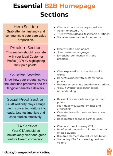
4. Social Proof Section
Credibility plays a huge role in converting visitors into leads. Use testimonials and case studies effectively.
What to Include:
Customer testimonials that highlight specific problems solved.
Headshots and business affiliations for authenticity.
Case studies or success stories with quantifiable results.
Logos of well-known customers or partners.
Checklist:
✅ Relevant testimonials solving real pain points.
✅ High-quality customer images and credentials.
✅ Case studies with measurable success metrics.
✅ Recognizable client or partner logos.
5. CTA Section
Your CTA should be unmistakably clear and guide visitors toward conversion.
What to Include:
A strong, action-oriented CTA (e.g., “Get a Quote,” “Start Free Trial”).
Reinforcement of motivation, such as a customer testimonial.
Trust signals, like “risk-free” or “cancel anytime” disclaimers.
A secondary CTA for visitors not ready to commit (e.g., “Download a Whitepaper”).
Checklist:
✅ Clear and direct primary CTA.
✅ Reinforced motivation with testimonials or case studies.
✅ Risk-free elements to reduce hesitation.
✅ Secondary CTA for nurturing hesitant visitors.
Common Mistakes to Avoid & How to Fix Them
A poorly designed B2B homepage can drive potential customers away instead of converting them into leads. Here’s how to avoid these mistakes and optimize your homepage for better engagement and conversions.
1. Lack of Clarity
Mistake:
Using jargon-heavy or vague headlines that don’t immediately explain what your business does. If visitors can’t grasp your value proposition in seconds, they’ll leave.
How to Fix It:
✅ Use a clear, concise headline that communicates your unique selling point (USP).
✅ Write in simple, customer-focused language, avoiding technical jargon.
✅ Include a subheadline that further clarifies your product/service.
✅ Add a hero image or video that visually supports your offering.
💡 Example: Instead of “Innovative AI-Powered Data Solutions,” say “Boost Your Business with AI-Driven Insights for Smarter Decisions.”
2. Weak Call-to-Action (CTA)
Mistake:
A generic, hidden, or uninspiring CTA leads to lost conversions. Visitors need clear direction on what to do next.
How to Fix It:
✅ Use a strong, action-oriented CTA, such as “Get a Free Demo” or “Start Your Free Trial.”
✅ Place the CTA above the fold so users see it immediately.
✅ Use contrasting colors and bold text to make it stand out.
✅ Ensure every key section of your homepage includes a logical next step.
💡 Example: Instead of “Learn More,” use “Download the Free Guide Now.”
3. Too Much Text
Mistake:
Long, dense paragraphs overwhelm visitors. Most users scan rather than read word-for-word.
How to Fix It:
✅ Use bullet points, subheadings, and short paragraphs for easy readability.
✅ Keep sentences concise and straight to the point.
✅ Use visual elements like icons, images, and infographics to communicate key points.
✅ Highlight key takeaways in bold so they stand out.
💡 Example: Instead of a full paragraph explaining your service, break it into a list of benefits with icons.
4. Ignoring Trust Elements
Mistake:
Not including social proof, client testimonials, or trust signals reduces credibility and makes potential clients sceptical.
How to Fix It:
✅ Display logos of trusted clients or partners at the top or middle of the page.
✅ Add customer testimonials or case studies to show real-world results.
✅ Include certifications, industry awards, or media mentions to establish authority.
✅ Use video testimonials for a more personal touch.
💡 Example: “Trusted by 500+ businesses, including [Client Logo 1], [Client Logo 2], and [Client Logo 3].”
5. Slow Loading Speed
Mistake:
A slow website leads to high bounce rates. 47% of users expect a webpage to load in under 2 seconds (Google).
How to Fix It:
✅ Compress images and use next-gen formats like WebP.
✅ Enable browser caching to reduce loading times for returning visitors.
✅ Use a content delivery network (CDN) to distribute content faster.
✅ Minimize excessive scripts and plugins that slow down performance.
✅ Use Google PageSpeed Insights to identify performance bottlenecks.
💡 Example: Compressing images alone can reduce page load time by 30-40%.
6. No Mobile Optimization
Mistake:
With over 50% of B2B buyers using mobile devices for research, a non-responsive homepage leads to lost leads.
How to Fix It:
✅ Use a responsive design that adjusts to different screen sizes.
✅ Ensure CTAs, menus, and images are mobile-friendly and easy to tap.
✅ Test your site on different devices and browsers for usability.
✅ Optimize for fast mobile loading speeds using AMP (Accelerated Mobile Pages).
💡 Example: A mobile-optimized site can improve conversions by up to 67% (Google).
7. Unclear Navigation
Mistake:
A confusing or cluttered menu frustrates users, leading them to exit your site without taking action.
How to Fix It:
✅ Use a simple, intuitive menu with clear categories.
✅ Limit the main navigation to 5-7 key sections (e.g., Home, About, Services, Case Studies, Contact).
✅ Include a sticky navigation bar for easy access while scrolling.
✅ Add a search function for quick access to information.
💡 Example: Instead of listing every service in the main menu, use dropdowns or a structured sitemap.
Auditing your B2B Homepage
A B2B homepage audit helps identify gaps that could be preventing conversions. By evaluating your homepage through these five pillars—Value, Relevance, Clarity, Motivation, and Friction—you can improve user experience, build trust, and drive more leads.
1. VALUE – Does the Homepage Clearly Communicate Tangible Benefits?
Your homepage should immediately convey why your business is valuable to potential clients.
Audit Checklist:
✅ Clear Unique Value Proposition (UVP) – Can visitors understand what makes you different in 5 seconds?
✅ Quantifiable Benefits – Does the homepage mention how your product/service helps clients save time, reduce costs, or boost revenue?
✅ Supporting Visuals & Data – Are statistics, case studies, or infographics used to reinforce your value?
✅ Compelling Hero Section – Does the top section of your homepage grab attention and highlight the main benefit?
💡 Fixes if Missing:
- Rewrite the headline and subheadline to clearly state how your business solves a problem.
- Add data-driven proof (e.g., “Trusted by 500+ businesses, saving 30% operational costs”).
- Use a before-and-after comparison to show impact.
🔍 Example: Instead of “Innovative AI Solutions,” say:
“Boost Operational Efficiency by 40% with AI-Powered Analytics”
2. RELEVANCE – Does the Homepage Match Visitor Expectations?
Visitors should feel they’re in the right place immediately. If your homepage messaging doesn’t align with their needs, they’ll leave.
Audit Checklist:
✅ Alignment with Target Audience Needs – Is the messaging specific to B2B decision-makers (CEOs, procurement teams, etc.)?
✅ Consistent Brand Messaging – Does the content match what’s promised in ads, emails, and search results?
✅ Industry-Specific Language – Is the content tailored for your niche (e.g., SaaS, manufacturing, consulting)?
✅ Localized & Personalized Content – If applicable, does the homepage cater to different regions, industries, or buyer personas?
💡 Fixes if Missing:
- Update headlines and case studies to reflect customer pain points.
- Segment homepage sections for different industries or use cases.
- Personalize based on visitor type (e.g., “For Manufacturers | For Distributors”).
🔍 Example: Instead of a generic “Solutions for Businesses,” use:
“AI-Powered Forecasting for Retail, Manufacturing & Logistics”
3. CLARITY – Is the Content Easy to Understand?
Unclear messaging, excessive jargon, and complex navigation confuse visitors and hurt conversions.
Audit Checklist:
✅ Simple, Jargon-Free Language – Can someone outside your industry understand the key message?
✅ Short, Digestible Sections – Is the homepage skimmable with bullet points, subheadings, and visuals?
✅ Strong Visual Hierarchy – Are the most important messages & CTAs clearly emphasized?
✅ Clear Navigation – Can users quickly find product details, pricing, and contact information?
💡 Fixes if Missing:
- Rewrite long paragraphs into concise, actionable statements.
- Improve typography, spacing, and contrast for better readability.
- Add icons, explainer videos, or infographics to simplify complex concepts.
🔍 Example: Instead of a vague “We optimize processes,” say:
“Cut Processing Time by 50% with Our AI Workflow Automation”
4. MOTIVATION – Does the Homepage Encourage Action?
Your homepage should guide users towards conversions through compelling CTAs and persuasive elements.
Audit Checklist:
✅ Strong Call-to-Action (CTA) – Are CTAs specific, action-oriented, and prominent? (e.g., “Schedule a Free Consultation”)
✅ Urgency & Scarcity – Does the homepage use limited-time offers, free trials, or success stories to encourage action?
✅ Social Proof & Trust Signals – Are testimonials, case studies, awards, and certifications displayed?
✅ Multiple Conversion Points – Are there different CTAs for visitors at various buying stages (e.g., “Learn More,” “Get a Quote,” “Book a Demo”)?
💡 Fixes if Missing:
- Add buttons above the fold with clear CTAs.
- Showcase client success metrics (e.g., “97% Customer Retention Rate”).
- Use interactive elements (e.g., ROI calculator, chatbot, quiz) to engage visitors.
🔍 Example: Instead of “Contact Us,” use:
“Book a Free Strategy Call – Limited Slots Available”
5. FRICTION – Are There Any Barriers to Conversion?
Any confusing, slow, or untrustworthy element on your homepage can prevent users from taking action.
Audit Checklist:
✅ Fast Loading Speed – Does the homepage load in under 3 seconds? (Use Google PageSpeed Insights)
✅ Mobile Optimization – Is the site fully responsive and easy to navigate on mobile devices?
✅ Minimal Form Fields – Are signup/contact forms simple and not asking for too much information upfront?
✅ Live Chat or Easy Contact Options – Can users quickly reach support if they have questions?
✅ Secure & Professional Design – Does the site look credible with an SSL certificate, clear privacy policy, and no broken links?
💡 Fixes if Missing:
- Optimize images, reduce scripts, and use a CDN to improve speed.
- Simplify forms—only ask for essential details (e.g., Name, Email, Company).
- Ensure mobile usability by testing on different devices.
- Add FAQs, chatbot support, or a knowledge base for quick assistance.
🔍 Example: Instead of a 10-field lead form, reduce it to:
“Get Your Free Report – Just Enter Your Email”
🛠 Final Step: Scoring Your Homepage
Rate each category from 1 to 5 (1 = Poor, 5 = Excellent) to identify weak spots:
| Category | Score (1-5) | Notes for Improvement |
|---|---|---|
| Value | ⭐⭐⭐⭐ | Clarify UVP in the hero section |
| Relevance | ⭐⭐⭐ | Add more industry-specific content |
| Clarity | ⭐⭐⭐⭐ | Simplify technical descriptions |
| Motivation | ⭐⭐⭐ | Strengthen CTAs and add urgency |
| Friction | ⭐⭐ | Improve mobile speed and reduce form fields |
If your homepage scores less than 20/25, focus on fixing weak areas to improve conversions. 🚀
Do’s and Don’ts for Creating a High-Performing B2B Homepage
| Category | ✅ Do’s | ❌ Don’ts |
|---|---|---|
| Value Proposition | Clearly communicate your unique value in the first 5 seconds. | Avoid vague, generic statements like “We provide innovative solutions.” |
| Headline & Messaging | Use a strong, benefit-driven headline (e.g., “Increase Efficiency by 40% with AI-Powered Analytics”). | Don’t use industry jargon or complex terms that confuse visitors. |
| Navigation | Keep navigation simple & intuitive with clear menu items. | Don’t clutter the menu with too many options—stick to key pages like “Solutions,” “Pricing,” and “Contact.” |
| Call-to-Action (CTA) | Use clear, action-oriented CTAs (e.g., “Book a Free Demo” or “Get Started”). | Don’t use weak or generic CTAs like “Click Here” or “Submit.” |
| Speed & Performance | Optimize for fast loading times (under 3 seconds) using compressed images & caching. | Don’t overload the page with heavy media files or unnecessary scripts. |
| Mobile Optimization | Ensure your homepage is fully responsive on all devices. | Don’t ignore mobile users—B2B buyers often browse on mobile before switching to desktop. |
| Social Proof | Showcase client testimonials, logos, case studies, and reviews to build trust. | Don’t leave out credibility elements—lack of proof can reduce conversions. |
| Content Format | Use short, scannable sections with bullet points, icons, and visuals. | Avoid large blocks of text—visitors won’t read long paragraphs. |
| SEO & Keywords | Optimize for B2B-relevant keywords (e.g., “AI-driven supply chain solutions”). | Don’t forget SEO—lack of optimization can hurt visibility in search results. |
| Trust Signals | Display security badges, privacy policies, and compliance certifications. | Don’t ignore security concerns—B2B buyers look for credibility signals. |
| Conversion Forms | Keep lead capture forms short and simple(Name, Email, Company). | Don’t ask for too much upfront—long forms decrease conversions. |
| Personalization | Customize content for different industries, buyer personas, or geographic regions. | Don’t use a one-size-fits-all approach—B2B buyers want tailored messaging. |
| Live Chat & Contact | Provide easy ways to connect (live chat, email, phone, or chatbot). | Don’t make it hard for visitors to contact you—a lack of support kills conversions. |
| A/B Testing | Regularly test different headlines, CTAs, and layouts to optimize performance. | Don’t assume your first design is perfect—continuous testing is key. |
By following these best practices and avoiding common mistakes, your B2B homepage can become a powerful lead-generation machine! 🚀
Conclusion: Building a High-Converting B2B Homepage
Your B2B homepage is the first impression potential clients have of your business, making it a crucial element in your digital strategy. It should instantly communicate value, address customer pain points, and provide a seamless user experience that guides visitors toward conversion. A well-optimized B2B homepage not only captures attention but also establishes credibility, nurtures leads, and drives business growth.
By implementing a structured approach—focusing on clarity, relevance, motivation, and reducing friction—you can create a B2B homepage that turns visitors into leads and, ultimately, into long-term customers. Additionally, avoiding common mistakes such as unclear messaging, slow loading speeds, and weak calls to action ensures your homepage is both user-friendly and conversion-optimized.
In a competitive digital landscape, a well-designed B2B homepage acts as a powerful sales tool, helping your business attract the right audience, generate trust, and drive meaningful engagement. Continually test, analyze, and refine your homepage to keep it aligned with buyer expectations, SEO best practices, and lead generation goals. With the right strategy, your B2B homepage can become a high-performing asset that fuels business success. 🚀
Frequently Asked Questions About B2B Homepage