Introduction:
In the fast-evolving landscape of CTA in B2B marketing, where decision-making involves multiple stakeholders and complex processes, a well-crafted Call to Action can significantly impact engagement and conversions. Research shows that 90% of B2B buyers initiate their journey with an online search, and businesses that leverage strong CTAs experience a 202% increase in conversions. Additionally, B2B emails with a clear CTA achieve a 371% higher click-through rate, highlighting the importance of strategic messaging. A compelling CTA in B2B marketing serves as a crucial guide, directing potential clients toward the next steps in their buyer journey, ultimately driving business growth and success.
What is a Call to Action – CTA in B2B Marketing?
A CTA in B2B marketing is a strategic prompt designed to encourage potential clients to take a specific action that moves them further along the sales funnel. It can appear as a button, hyperlink, banner, or text directive, guiding the target audience toward actions such as downloading a whitepaper, scheduling a product demo, signing up for a webinar, or requesting a consultation.
Unlike B2C marketing—where CTAs typically aim for immediate purchases—B2B marketing revolves around longer decision-making cycles that involve multiple stakeholders. As a result, CTA in B2B marketing needs to be carefully crafted to align with different stages of the buyer’s journey. For example:
- Awareness Stage: “Download Our Industry Report” (educating potential clients about a problem or trend)
- Consideration Stage: “Watch a Product Demo” (helping buyers evaluate solutions)
- Decision Stage: “Get a Custom Quote” (driving action toward a purchase or partnership)
Additionally, the placement and wording of CTAs play a critical role in engagement. Research indicates that B2B companies using well-optimized CTAs experience a 202% boost in conversions, while B2B emails with a clear CTA see a 371% increase in click-through rates.
To maximise effectiveness, CTA in B2B marketing should be:
✅ Personalized – Addressing the specific needs and pain points of the audience
✅ Value-Driven – Clearly communicating the benefit of taking the next step
✅ Visually Distinct – Designed to stand out on a webpage or email
✅ Strategically Placed – Positioned at key touchpoints where decision-making happens
By implementing a strong CTA in B2B marketing, businesses can enhance engagement, streamline lead nurturing, and ultimately drive higher conversions throughout the buyer’s journey.
The Role of CTAs in B2B Marketing
A well-crafted Call to Action (CTA) in B2B marketing serves as a critical driver for lead generation, engagement, and conversions. Unlike in B2C, where impulse-driven purchases are common, B2B decision-making involves multiple stakeholders, longer sales cycles, and extensive research. Therefore, a strategic CTA not only encourages action but also guides prospects seamlessly through the buyer’s journey.
1. Lead Generation: Turning Visitors into Leads
B2B companies rely heavily on lead generation to fuel their sales pipelines. A strong CTA in B2B marketing can help capture leads by offering valuable content or services in exchange for contact information.
🔹 How to Do It:
- Offer gated content such as eBooks, whitepapers, or reports in exchange for an email address.
- Provide free consultations or demo requests to entice prospects into a direct conversation.
- Use forms with minimal fields to reduce friction while gathering essential data.
✅ Examples of Lead Generation CTAs:
- “📥 Download the eBook to Learn Industry Trends” (For gated content)
- “📅 Request a Free Consultation Today!” (For professional services)
- “🚀 Get a Personalized Demo of Our Software” (For SaaS solutions)
2. Educating and Engaging Prospects
B2B buyers require substantial information before making a purchase decision. Educational CTAs help nurture prospects by delivering valuable, relevant content while keeping them engaged.
🔹 How to Do It:
- Use data-driven blog posts, case studies, and webinars to establish authority.
- Leverage interactive content such as quizzes, assessments, and calculators to engage users.
- Create segmented CTAs that cater to different audience needs and pain points.
✅ Examples of Educational CTAs:
- “📖 Read Our Case Study to See How We Helped [Client Name]” (For credibility building)
- “🎥 Watch the Webinar on AI in B2B Marketing” (For knowledge sharing)
- “🛠️ Explore Our Solutions for Your Business Needs” (For solution awareness)
3. Guiding Prospects Through the Sales Funnel
A B2B sales cycle involves multiple touchpoints, and CTAs must be tailored to each stage to maintain momentum.
🔹 How to Do It:
- Attract potential customers with awareness-stage CTAs that offer informational resources.
- Move them into consideration by providing interactive experiences like free trials or product demos.
- Drive conversions by making the decision-making process seamless with direct action CTAs.
✅ Examples of Sales Funnel CTAs:
Top of the Funnel (Awareness):
- “📄 Download Our Whitepaper on Industry Best Practices” (Educational content)
Middle of the Funnel (Consideration):
- “🖥️ Schedule a Live Demo with Our Experts” (Product experience)
Bottom of the Funnel (Decision):
- “🔑 Start Your Free Trial – No Credit Card Required!” (Encouraging action)
4. Enhancing Conversion Rates with Optimized CTAs
A well-placed CTA in B2B marketing ensures that potential clients do not drop off without taking the desired action. Conversion rates can be significantly improved by optimising the design, placement, and wording of CTAs.
🔹 How to Do It:
- Use Action-Oriented Language: Phrases like “Get,” “Start,” or “Claim” make CTAs more compelling.
- Create a Sense of Urgency: Limited-time offers encourage quicker decision-making.
- A/B Test CTA Variations: Experiment with different colors, button texts, and placements to determine what works best.
- Ensure CTA Visibility: Position CTAs prominently on landing pages, blogs, and emails for higher engagement.
✅ Examples of High-Converting CTAs:
- “🔥 Limited Offer: Get 50% Off Your First Month – Sign Up Now!”
- “📊 Claim Your Free Market Analysis Report – Only for the First 50 Registrations!”
- “🚀 Let’s Talk! Schedule Your Free Strategy Call Today.”
Best Practices for Creating Effective B2B CTAs
A well-crafted CTA in B2B marketing can significantly impact lead generation, engagement, and conversions. To maximise effectiveness, it’s essential to follow best practices and leverage the right tools for optimisation.
1. Be Clear and Concise
🔹 Why It Matters:
B2B decision-makers don’t have time for vague or complex messaging. Your CTA should immediately communicate the action you want the user to take.
🔹 How to Do It:
- Use direct, action-oriented language such as:
✅ “Get Started Today”
✅ “Talk to an Expert”
✅ “Request a Demo” - Avoid jargon and ensure clarity.
🔹 Tools to Use:
- Hemingway Editor – Helps simplify and clarify CTA wording.
- Grammarly – Ensures grammatically sound and persuasive CTAs.
2. Offer Value
🔹 Why It Matters:
B2B buyers are driven by ROI and insights. Your CTA should promise something valuable in exchange for their engagement.
🔹 How to Do It:
- Offer free trials, whitepapers, or industry insights.
- Clearly state the benefit the user will receive.
✅ Examples:
- “Download Our Exclusive Industry Report”
- “Sign Up for a Free 7-Day Trial”
- “Get a Custom Strategy Session”
🔹 Tools to Use:
- HubSpot – Helps create lead magnets and gated content for valuable CTAs.
- Canva – Creates visually appealing graphics to emphasize value in CTAs.
3. Create a Sense of Urgency
🔹 Why It Matters:
A compelling CTA should make the user feel they need to act immediately rather than delaying.
🔹 How to Do It:
- Use time-sensitive language such as:
✅ “Limited-Time Offer – Claim Your Spot Now”
✅ “Only 5 Spots Left – Register Today”
✅ “Exclusive Deal Ends Soon” - Highlight scarcity to drive action.
🔹 Tools to Use:
- OptinMonster – Allows you to create countdown timers and exit-intent popups to encourage urgency.
- Deadline Funnel – Automates time-based CTA campaigns for urgency-driven conversions.
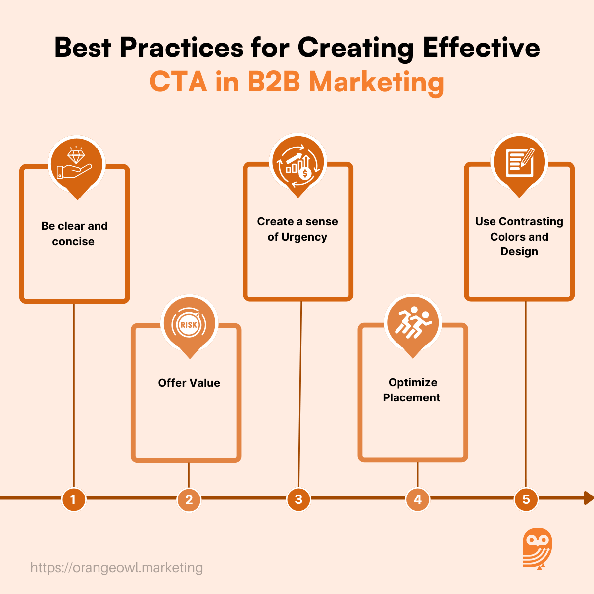
4. Optimize Placement
🔹 Why It Matters:
A CTA’s position on a page can dramatically impact conversion rates.
🔹 How to Do It:
- Place CTAs above the fold on landing pages.
- Include inline CTAs in blog posts for seamless engagement.
- Use sticky CTAs that follow the user as they scroll.
✅ Best Placement Examples:
- Landing Pages: “Request a Free Demo” at the top.
- Blog Posts: “Download the Full Report” embedded in the content.
- Exit Popups: “Before You Go – Claim Your Free Guide!”
🔹 Tools to Use:
- Crazy Egg – Provides heatmaps to track user interactions with CTAs.
- Google Optimize – Helps test CTA placement for improved performance
5. Use Contrasting Colors and Design
🔹 Why It Matters:
A visually striking CTA button grabs attention and increases clicks.
🔹 How to Do It:
- Choose bold, contrasting colors for CTA buttons.
- Use large, legible fonts with clear spacing.
- Incorporate visual cues like arrows or icons.
✅ Examples:
- Red or orange buttons for high visibility.
- Bigger, bolder text on CTA buttons.
🔹 Tools to Use:
- Adobe XD / Figma – For designing visually optimized CTA buttons.
- Canva – For easily creating high-contrast CTA banners.
6. A/B Test for Performance
🔹 Why It Matters:
Testing different variations of CTAs helps identify what works best for your audience.
🔹 How to Do It:
- Test different wording, colors, and placements.
- Compare button vs. text-based CTAs.
- Use data-driven insights to refine CTAs.
✅ Examples:
- Version A: “Start Your Free Trial”
- Version B: “Get Instant Access – No Credit Card Required”
- Analyze which version gets more clicks and conversions.
🔹 Tools to Use:
- Google Optimize – For split testing CTA versions.
- Unbounce – For A/B testing landing pages and CTAs.
- Hotjar – Tracks user behavior to see how visitors engage with CTAs.
Common Pitfalls in Creating CTAs in B2B Marketing
Creating an effective CTA in B2B marketing requires a strategic approach, but many businesses fall into common traps that hinder engagement and conversion rates. Here are some major pitfalls to avoid:
1. Vague or Weak Messaging
🔹 Why It’s a Problem:
A generic CTA like “Click Here” or “Learn More” lacks clarity and does not convey value, leading to lower engagement.
🔹 How to Avoid It:
- Be specific about what the user will get.
- Use action-driven language like:
✅ “Download the Free Industry Report” instead of “Learn More”
✅ “Get Your Personalized Quote” instead of “Click Here”
🔹 Example of a Poor vs. Strong CTA:
❌ “See Our Solutions” → ✅ “Explore AI-Powered Solutions for Your Business”
2. No Clear Value Proposition
🔹 Why It’s a Problem:
B2B buyers need a strong reason to take action. If your CTA doesn’t communicate the benefit, users won’t engage.
🔹 How to Avoid It:
- Highlight what’s in it for them.
- Use CTAs like:
✅ “Get 10X ROI Insights – Download the Report”
✅ “Improve Your Sales Pipeline – Schedule a Free Consultation”
🔹 Example of a Poor vs. Strong CTA:
❌ “Sign Up” → ✅ “Sign Up & Get Exclusive Market Insights”
3. Ignoring the Buyer’s Journey
🔹 Why It’s a Problem:
B2B sales cycles are long, and different buyers need different CTAs at each stage. Using a “Buy Now” CTA too early can drive prospects away.
🔹 How to Avoid It:
Match CTAs to each stage of the funnel:
✅ Top of the Funnel (Awareness) → “Download Our Whitepaper”
✅ Middle of the Funnel (Consideration) → “Request a Live Demo”
✅ Bottom of the Funnel (Decision) → “Start Your Free Trial”
🔹 Example of a Poor vs. Strong CTA Placement:
❌ “Request a Quote” on an awareness-stage blog post
✅ “Read the Case Study” for educating early-stage leads
4. Poor CTA Placement
🔹 Why It’s a Problem:
If a CTA is buried at the bottom of a page or hidden in a cluttered layout, users might miss it completely.
🔹 How to Avoid It:
- Place CTAs above the fold and throughout the content.
- Use sticky CTAs or sidebar CTAs for visibility.
- Insert inline CTAs in blog posts naturally.
🔹 Example of a Poor vs. Strong CTA Placement:
❌ CTA only at the bottom of a long page → ✅ CTA above the fold + mid-content
🔹 Tools to Help:
- Crazy Egg – Heatmaps to analyze CTA visibility
- Google Optimize – A/B test different CTA placements
5. Lack of Visual Contrast
🔹 Why It’s a Problem:
A CTA that blends into the page background is easily overlooked.
🔹 How to Avoid It:
- Use contrasting colours that stand out.
- Make CTA buttons larger and easy to click.
- Use whitespace around CTAs for better focus.
🔹 Example of a Poor vs. Strong CTA Design:
❌ A gray CTA on a white background → ✅ A bright orange CTA on a white background
🔹 Tools to Help:
- Canva – Design high-contrast CTAs
- Adobe XD – Test different CTA color combinations
6. Too Many CTAs on One Page
🔹 Why It’s a Problem:
If there are multiple competing CTAs (e.g., “Download Now”, “Request a Demo”, “Subscribe Here” all on the same page), users may feel overwhelmed and take no action at all.
🔹 How to Avoid It:
- Focus on one primary CTA per page.
- Use secondary CTAs only if necessary.
- Guide users with a clear next step.
🔹 Example of a Poor vs. Strong CTA Approach:
❌ Three CTAs on a landing page → ✅ One main CTA + one supporting CTA
🔹 Tools to Help:
- Unbounce – Helps create streamlined landing pages
- Hotjar – Tracks user interactions with multiple CTAs
7. Not Optimized for Mobile Users
🔹 Why It’s a Problem:
If CTAs aren’t mobile-friendly, they may be difficult to click, reducing conversions.
🔹 How to Avoid It:
- Use large, tappable buttons for mobile.
- Ensure the CTA loads quickly and is not blocked by popups.
🔹 Example of a Poor vs. Strong Mobile CTA:
❌ A small CTA button that’s hard to tap → ✅ A large, thumb-friendly button
🔹 Tools to Help:
- Google Mobile-Friendly Test – Checks CTA mobile usability
- PageSpeed Insights – Ensures fast loading times
8. Failing to A/B Test CTAs
🔹 Why It’s a Problem:
Without testing different CTA variations, you may miss out on higher-performing options.
🔹 How to Avoid It:
- Run A/B tests on CTA wording, placement, and design.
- Track conversion rates and optimize based on results.
🔹 Example of a Poor vs. Strong Testing Approach:
❌ Using the same CTA for months without changes → ✅ Testing “Get a Free Trial” vs. “Start Your Free Trial Today”
🔹 Tools to Help:
- Google Optimize – A/B tests CTA effectiveness
- Optimizely – Helps experiment with CTA copy and design
Dos and Don’ts of Creating CTAs in B2B Marketing
| ✅ Dos | ❌ Don’ts |
|---|---|
| Be Clear & Specific – Use direct, action-oriented language (e.g., “Download the Industry Report”). | Avoid Vague CTAs – Generic phrases like “Click Here” or “Learn More” lack clarity and impact. |
| Offer Value – Clearly communicate what the user will gain (e.g., “Get a Free Consultation”). | Don’t Ask Without Giving – Avoid CTAs that demand action without offering benefits. |
| Match CTA to Buyer’s Journey – Use awareness-stage CTAs (“Read the Whitepaper”) for early leads and decision-stage CTAs (“Request a Quote”) for ready buyers. | Don’t Use One CTA for All Stages – A “Buy Now” CTA on an awareness-stage blog post is premature. |
| Create a Sense of Urgency – Use time-sensitive language like “Limited Spots Available” or “Offer Ends Soon”. | Avoid Passive CTAs – Phrases like “Whenever You’re Ready” lack motivation. |
| Optimize Placement – Ensure CTAs are highly visible, placed above the fold, and repeated in strategic sections. | Don’t Hide CTAs – Placing them at the bottom of long pages reduces visibility. |
| Use Contrasting Colors – Make CTA buttons stand out with bold, eye-catching colors. | Don’t Use Low-Contrast Design – A dull CTA blends into the page and gets ignored. |
| Test & Optimize – Run A/B tests on different CTA wording, colors, and placements. | Don’t Assume One CTA Works for All – Testing variations improves performance. |
| Make CTAs Mobile-Friendly – Use large, tappable buttons and responsive designs. | Avoid Small or Hard-to-Click CTAs – Unoptimized CTAs frustrate mobile users. |
| Use Data & Analytics – Track performance through tools like Google Analytics or Hotjar. | Don’t Ignore Performance Metrics – Failing to analyze CTA performance can lead to missed opportunities. |
Conclusion: The Power of CTA in B2B Marketing
An effective CTA in B2B marketing is more than just a button or a phrase—it is a strategic tool that guides potential clients through the buyer’s journey, boosts engagement, and drives conversions. By crafting clear, value-driven CTAs tailored to different sales funnel stages, businesses can enhance lead generation and nurture prospects effectively.
Avoiding common pitfalls like vague messaging, poor placement, or lack of urgency ensures that CTAs perform at their best. Additionally, leveraging A/B testing, optimizing for mobile, and using data-driven insights can further refine CTA strategies.
In today’s competitive B2B landscape, a well-placed Call to Action can be the difference between a lost opportunity and a successful conversion. Implementing best practices will help businesses maximize their marketing ROI and create a seamless path for potential clients to take meaningful action.
Frequently Asked Questions (FAQs) about CTA in B2B Marketing