Introduction: The Power of an Effective Landing Page
In the fast-paced world of digital marketing, businesses invest significant time and resources in driving traffic to their websites. However, getting visitors to click on an ad or a search result is only half the battle—the real challenge is converting those visitors into leads, subscribers, or customers. This is where a well-designed landing page becomes a game-changer.
What is a Landing Page?
A landing page is a standalone web page created specifically for marketing campaigns, designed with a single goal in mind: conversion. Whether the objective is lead generation, product sales, webinar sign-ups, or app downloads, the landing page serves as a dedicated space to guide visitors toward taking the desired action.
Unlike a website’s homepage—which contains multiple links, navigation menus, and diverse content—a landing page is highly focused and free from distractions. This focused approach ensures that visitors don’t get lost in unnecessary information but instead move seamlessly toward the call to action (CTA).
Why Do Landing Pages Matter?
A well-optimized landing page is more than just a pretty design; it is a powerful tool for increasing conversion rates and maximizing return on investment (ROI) in marketing efforts. Here’s why landing pages are crucial:
- Higher Conversion Rates: Studies show that landing pages with a clear CTA convert significantly better than generic web pages.
- Targeted Messaging: Landing pages allow businesses to tailor their message to a specific audience segment, making them more effective.
- Lead Generation & Customer Acquisition: Whether collecting emails or making sales, landing pages streamline the process of turning visitors into customers.
- Improved Ad Performance: PPC ads (Google Ads, Facebook Ads, etc.) work best when they direct users to a dedicated, relevant landing page rather than a general website.
- Better Data & Insights: By tracking visitor behavior, click-through rates, and conversions, businesses can continuously optimize their landing pages for better results.
What Makes a Landing Page Successful?
Not all landing pages perform well. Many businesses make critical mistakes—from slow load times to weak CTAs—that cause visitors to leave without converting. To create a high-converting landing page, it must:
✔ Have a clear, attention-grabbing headline
✔ Provide a compelling value proposition
✔ Feature an engaging and relevant design
✔ Include trust signals like testimonials, security badges, and social proof
✔ Have a strong, action-driven CTA
✔ Be optimized for mobile and fast loading speeds
What You’ll Learn in This Guide
In this comprehensive guide, we’ll explore best practices for designing high-converting landing pages and highlight the common mistakes to avoid. By following these principles, you’ll be able to maximize conversions and turn traffic into tangible business results.
Essentials for Landing page
1. Compelling Headline: The First Impression Matters
The headline is the first thing visitors see when they land on your page. It should instantly communicate the value proposition of your offer and capture their interest. A strong headline:
✅ Clearly states the benefit (e.g., “Boost Your Sales with AI-Driven Marketing”)
✅ Is concise and engaging (6-12 words are ideal)
✅ Uses power words to evoke emotion (e.g., “Exclusive,” “Proven,” “Effortless”)
Example: Instead of saying, “Our Product Helps You Save Time,” say, “Save 10+ Hours a Week with Our Automation Tool.”
💡 Tip: Follow the 4 U’s Formula – Make your headline Useful, Unique, Ultra-Specific, and Urgent.
2. Engaging Visuals: Capturing Attention Instantly
Humans process visuals 60,000 times faster than text. High-quality images or videos help engage visitors and reinforce your message. Your visuals should:
✔️ Be relevant and support the content
✔️ Show the product in action (if applicable)
✔️ Evoke emotions that align with your brand message
Example: If you’re offering an online course, include an image of a happy student learning on a laptop. For SaaS products, an animated explainer video works wonders.
💡 Tip: Optimize images and videos for fast loading speeds to prevent slow performance.
3. Clear Call-to-Action (CTA): Directing Visitors to Take Action
Your Call-to-Action (CTA) is the most critical element of a landing page. It tells visitors what to do next, such as:
🚀 “Download the Free Guide”
🚀 “Start Your 7-Day Trial”
🚀 “Sign Up Now – No Credit Card Required”
A high-converting CTA:
✅ Uses action-oriented language
✅ Is visually prominent (contrasting color)
✅ Creates urgency (“Limited Spots Available”)
💡 Tip: Use first-person language in CTAs, like “Get My Free Report” instead of “Get Your Free Report.”
4. Lead Capture Form: Collecting the Right Information
Your lead capture form is where you collect visitor information (e.g., name, email, phone number). A poorly designed form can kill conversions.
✔️ Keep it short – Ask only essential details
✔️ Use autofill to make it easier for users
✔️ Highlight privacy and security (e.g., “We never share your information”)
💡 Tip: Forms with fewer than 5 fields convert better. If more details are needed, collect them later in the sales process.
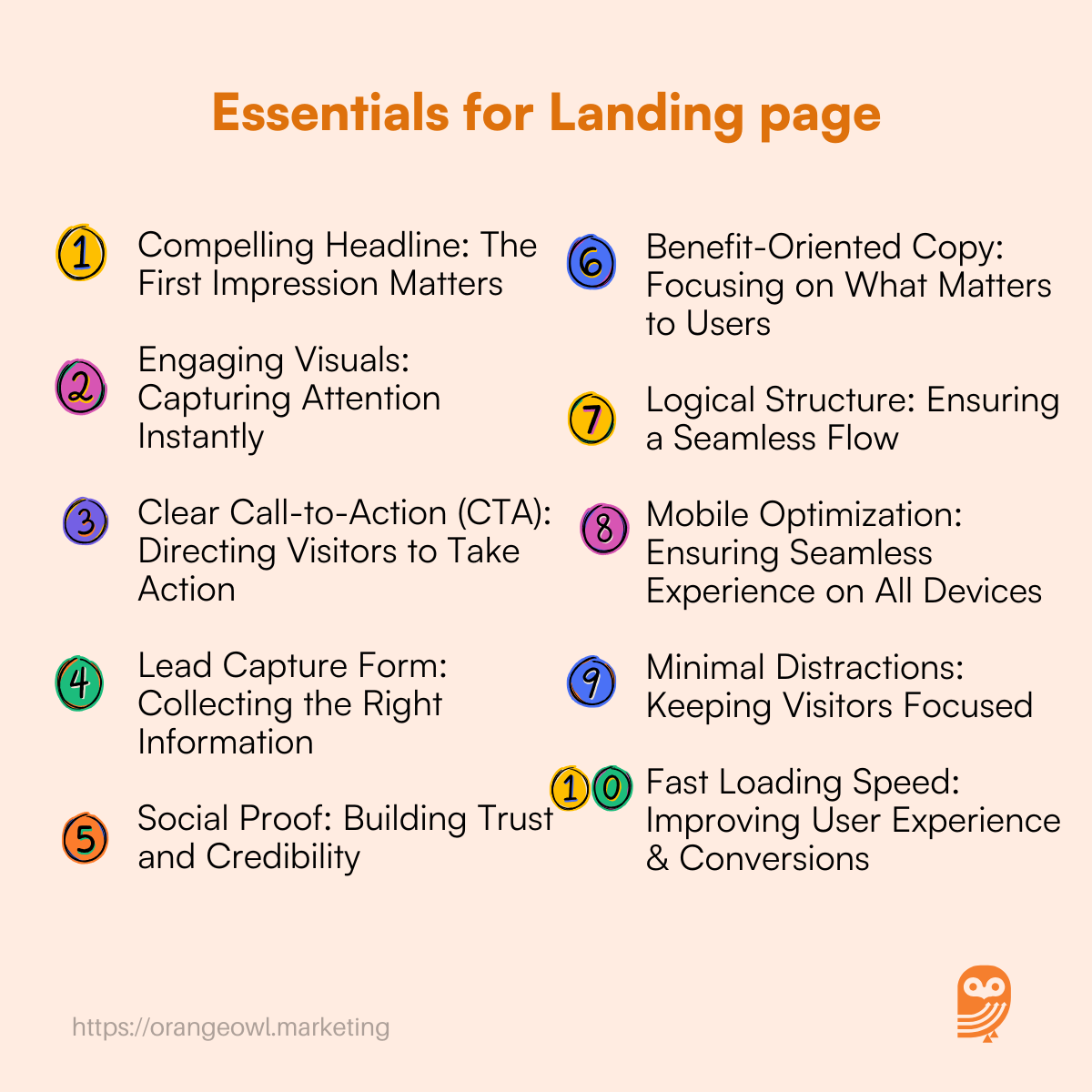
5. Social Proof: Building Trust and Credibility
People trust the opinions of others. Social proof reassures visitors that your product or service is valuable. Include:
🌟 Testimonials from happy customers
🌟 Case studies showcasing real results
🌟 Logos of well-known clients
🌟 Trust badges (e.g., “Secure Checkout,” “GDPR Compliant”)
Example: “Since using [Product Name], our sales have increased by 45% – [Customer Name, Company].”
💡 Tip: Use video testimonials for greater authenticity.
6. Benefit-Oriented Copy: Focusing on What Matters to Users
Your landing page copy should focus on the benefits rather than just the features.
🔹 Feature: “Our software has an AI-powered dashboard.”
🔹 Benefit: “Save 5+ hours a week with AI-powered insights that automate reports.”
✔️ Use bullet points for easy readability
✔️ Address pain points and solutions
✔️ Avoid jargon – keep the language simple
💡 Tip: Speak directly to your audience using “You” instead of “We.” Example: “You’ll achieve more in less time” instead of “Our tool helps businesses improve efficiency.”
7. Logical Structure: Ensuring a Seamless Flow
A well-structured landing page follows the AIDA Model (Attention, Interest, Desire, Action):
- Attention – Catchy headline and visuals
- Interest – Explain why your product is valuable
- Desire – Use testimonials, benefits, and social proof
- Action – Clear CTA prompting the user to take the next step
💡 Tip: Use scroll-triggers to show CTAs at the right moment.
8. Mobile Optimization: Ensuring Seamless Experience on All Devices
With over 60% of traffic coming from mobile, your landing page must be mobile-friendly:
✔️ Use responsive design
✔️ Ensure fast loading speeds
✔️ Make CTA buttons thumb-friendly
💡 Tip: Test your landing page on different screen sizes before launching.
9. Minimal Distractions: Keeping Visitors Focused
The best landing pages eliminate distractions. That means:
❌ No excessive links
❌ No unnecessary pop-ups
❌ No navigation menus
💡 Tip: Use a one-column layout for maximum focus.
10. Fast Loading Speed: Improving User Experience & Conversions
A slow-loading landing page can lead to higher bounce rates. To optimize speed:
✔️ Compress images and videos
✔️ Minimize code (CSS & JavaScript)
✔️ Use a content delivery network (CDN)
💡 Tip: Use tools like Google PageSpeed Insights to analyze speed performance.
Best Practices for Designing High-Converting Landing Pages
Creating an effective landing page involves more than just attractive design. It requires a strategic approach that aligns with user intent and conversion goals. Here are the best practices that ensure high-converting landing pages:
1. Align Ad and Landing Page Messaging
One of the biggest reasons for high bounce rates is inconsistent messaging between an ad and the landing page. If your ad promises a “Free 7-Day Trial”, but your landing page doesn’t mention it clearly, visitors will feel misled.
How to fix it?
✔ Ensure your landing page matches the ad copy
✔ Use the same keywords, tone, and offer
✔ Avoid bait-and-switch tactics
💡 Example: If your Google ad says “Get 50% Off Premium Hosting Today”, your landing page should reinforce the same discount offer prominently.
2. Use A/B Testing to Improve Performance
Not all landing pages convert equally. A/B testing (split testing) helps optimize your page by testing variations of different elements, such as:
🔹 Headlines
🔹 Call-to-Action (CTA) buttons
🔹 Colors and design layouts
🔹 Lead capture forms
How to implement A/B Testing?
✔ Test one element at a time
✔ Use tools like Google Optimize, Unbounce, or Optimizely
✔ Analyze results and implement the best-performing version
💡 Example: If Version A of your CTA says “Sign Up Now” and Version B says “Get My Free Guide”, testing which one gets higher clicks helps improve conversions.
3. Maintain a Clean and Simple Layout
A cluttered landing page overwhelms visitors and reduces engagement. A clean, simple layout keeps the focus on your offer and CTA.
Best Practices:
✔ Use white space for better readability
✔ Keep text concise – bullet points work well
✔ Use contrasting colors for CTA buttons
💡 Tip: A one-column design performs better than multi-column layouts because it guides users smoothly toward the CTA.
4. Add Trust Signals for Credibility
People hesitate to provide personal information unless they trust your brand. Trust signals help build confidence and reduce skepticism.
Types of Trust Signals to Include:
✔ Customer testimonials
✔ Case studies showing success stories
✔ Logos of well-known brands you’ve worked with
✔ Security badges like SSL encryption, GDPR compliance, money-back guarantee
💡 Example: If you claim “Trusted by 100,000+ Customers”, adding recognizable brand logos or a short customer video testimonial can reinforce credibility.
5. Optimize for SEO and Speed
Even the best-designed landing page is ineffective if it’s slow or doesn’t appear in search results.
SEO Optimization Tips:
✔ Use relevant keywords in the headline and content
✔ Optimize meta descriptions and title tags
✔ Structure content using H1, H2, and H3 tags
Speed Optimization Tips:
✔ Compress images and use lazy loading
✔ Minimize JavaScript and CSS files
✔ Use CDN (Content Delivery Network) for faster performance
💡 Tip: Test your landing page speed using Google PageSpeed Insights and aim for a load time of under 3 seconds.
6. Focus on Mobile Optimization
With over 60% of web traffic coming from mobile, your landing page must be fully responsive and easy to navigate on smartphones.
✔ Use mobile-friendly buttons (thumb-friendly size)
✔ Ensure text is readable without zooming
✔ Test across different screen sizes
💡 Tip: Avoid pop-ups that cover the entire mobile screen, as Google penalizes such intrusive interstitials.
Common Landing Page Mistakes to Avoid
Even small mistakes on your landing page can harm conversions. Here are the most common errors to watch out for:
1. Too Many Form Fields
A long and complicated form discourages users from completing it.
❌ Asking for too much information upfront (e.g., full address, job title, phone number)
❌ Making all fields mandatory, even when unnecessary
Fix: Keep the form short and simple—only ask for essential details like name and email.
💡 Example: A 2-3 field form (Name, Email, Company Name) converts better than a 6+ field form.
2. Weak Call-to-Action (CTA)
A generic or unclear CTA reduces click-through rates.
❌ Using vague terms like “Submit” or “Click Here”
❌ Not making the CTA stand out visually
Fix:
✔ Use action-driven text (“Get My Free Ebook”)
✔ Make the button bold and prominent
💡 Example: “Claim Your 50% Discount” performs better than “Get Started.”
3. Slow Page Load Speed
A slow page frustrates users and increases bounce rates.
❌ Large unoptimized images
❌ Too many third-party scripts
Fix:
✔ Compress images
✔ Use browser caching
✔ Remove unnecessary code
💡 Tip: Pages that load within 2-3 seconds have higher conversion rates.
4. Lack of Social Proof
If visitors don’t see proof that others trust your business, they might hesitate to take action.
❌ No customer testimonials
❌ No company logos or trust badges
Fix:
✔ Showcase real customer reviews
✔ Add ratings or success metrics (e.g., “100,000+ users worldwide”)
💡 Example: “This tool helped us increase leads by 200%” – [Customer Name, Company]
5. Overwhelming Users with Too Many Choices
When visitors have too many options, they may not take any action.
❌ Multiple CTAs (e.g., “Sign Up,” “Subscribe,” “Download”)
❌ Too much information leading to decision fatigue
Fix:
✔ Keep one primary CTA
✔ Guide users toward one clear action
💡 Example: If your goal is lead generation, your only CTA should be “Get Your Free Guide”, rather than multiple unrelated CTAs.
6. Ignoring Mobile Users
A landing page that isn’t mobile-friendly will drive away potential leads.
❌ Non-responsive design
❌ Small text and unclickable buttons
Fix:
✔ Test the page on mobile devices
✔ Ensure CTAs are large enough to tap
💡 Tip: Google prioritizes mobile-friendly pages in search rankings.
Difference Between a Landing Page and a Homepage
| Feature | Landing Page | Homepage |
|---|---|---|
| Purpose | Designed for a specific marketing campaign to drive conversions (e.g., lead generation, sales, or sign-ups). | Serves as the main entry point to a website, providing an overview of the business, services, and navigation. |
| Navigation | Minimal or no navigation to keep visitors focused on the CTA. | Includes multiple navigation links to different sections of the website. |
| Call-to-Action (CTA) | Has a single, clear CTA (e.g., “Download Now,” “Sign Up,” or “Buy Now”). | May have multiple CTAs directing visitors to different pages (e.g., “Learn More,” “About Us,” “Services”). |
| Audience | Targets a specific audience from ads, email campaigns, or social media promotions. | Attracts a broad audience, including new and returning visitors. |
| Design Focus | Highly optimized for conversion with persuasive copy, visuals, and social proof. | Balanced between branding, information, and navigation options. |
| Traffic Source | Visitors typically arrive from paid ads, email campaigns, or promotional links. | Visitors come from direct traffic, organic search, and referrals. |
| Content Depth | Focused and concise, addressing a single value proposition. | Covers multiple aspects of the business, including products, services, and company information. |
| SEO Strategy | Usually not optimized for SEO but designed for paid advertising traffic. | Optimized for search engines to rank for multiple keywords and attract organic traffic. |
Which One Should You Use?
- Use a landing page for marketing campaigns, product promotions, and lead generation.
- Use a homepage for brand awareness, company information, and user navigation.
If your goal is conversions, a landing page is the best choice. If you want to introduce your business and guide visitors to different sections, your homepage serves that purpose.
Conclusion
A high-converting landing page is a crucial asset for any business looking to maximize its marketing efforts and drive real results. Whether you’re launching a new product, offering a special discount, or collecting leads, your landing page needs to be well-designed, targeted, and optimized for both user experience and performance.
By following the best practices outlined in this guide—such as aligning your messaging, simplifying your design, using persuasive CTAs, and incorporating trust signals—you can create landing pages that not only attract visitors but also compel them to take the desired action.
Additionally, being mindful of common landing page mistakes—like slow load times, cluttered designs, and weak CTAs—will help you avoid pitfalls that can hinder your conversions. Remember, the key to success is continuous testing and optimization to ensure your landing page is always performing at its best.
Ultimately, a landing page is a powerful tool in your marketing strategy that, when done right, can significantly improve your conversion rates, boost sales, and generate more leads. By focusing on user intent and providing a seamless journey from click to conversion, you’ll be on your way to achieving your business goals and maximizing your marketing ROI.
Now is the time to optimize and refine your landing pages to unlock their full potential—your business’s success is just a well-crafted landing page away! 🌟
Frequently Asked Questions(FAQs) on Landing Pages